
The Benefits of Responsive Design: How LaunchCMS Ensures Seamless User Experience Across Devices
Why Responsive Design Matters in a Multi-Device World
In today’s digital landscape, users access websites from a wide range of devices—desktops, tablets, and smartphones. A site that looks great on a desktop but appears broken on a mobile device risks losing potential visitors and customers. That’s where responsive web design comes in. It ensures that websites automatically adjust to different screen sizes, offering a consistent and engaging user experience.
For small businesses and nonprofits, having a mobile-friendly website is no longer optional—it’s essential. With LaunchCMS, users can build and manage professional websites that adapt seamlessly to any device, ensuring their brand remains accessible and visually appealing across platforms.
What is Responsive Web Design?
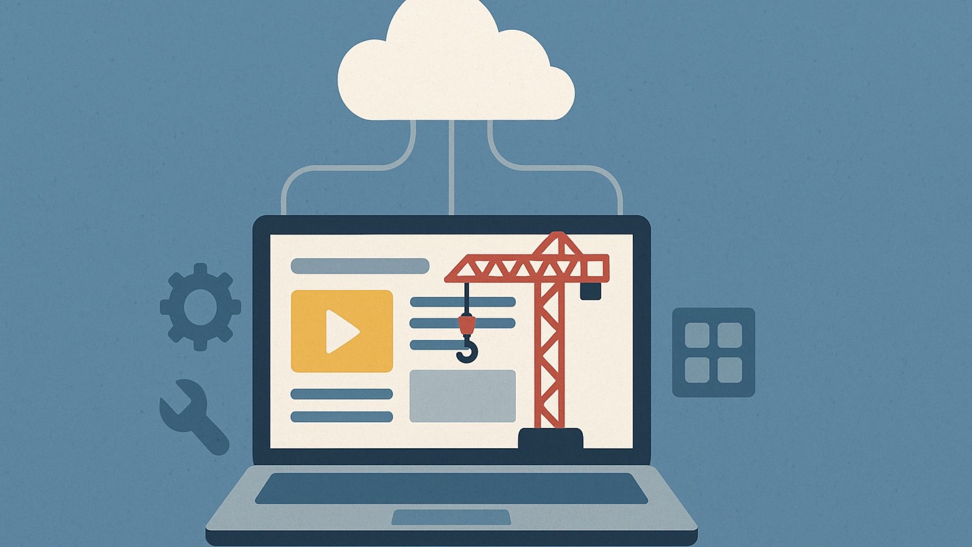
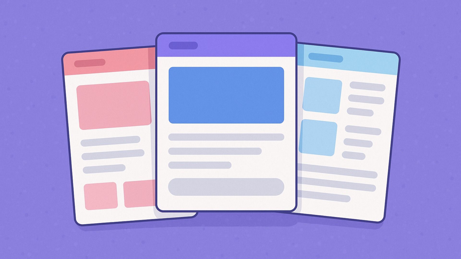
Responsive web design (RWD) is a web development approach that allows a site to adjust dynamically to different screen sizes and orientations. Instead of creating separate versions of a website for desktop and mobile, a single, fluid layout is designed to fit any screen.
Key components of responsive design include:
- Flexible grids that resize elements proportionally
- Fluid images that scale without distortion
- Media queries that detect screen size and adjust styles accordingly
By implementing these elements, a website maintains usability and aesthetic appeal, enhancing the overall user experience (UX).
How LaunchCMS Delivers a Seamless Responsive Experience
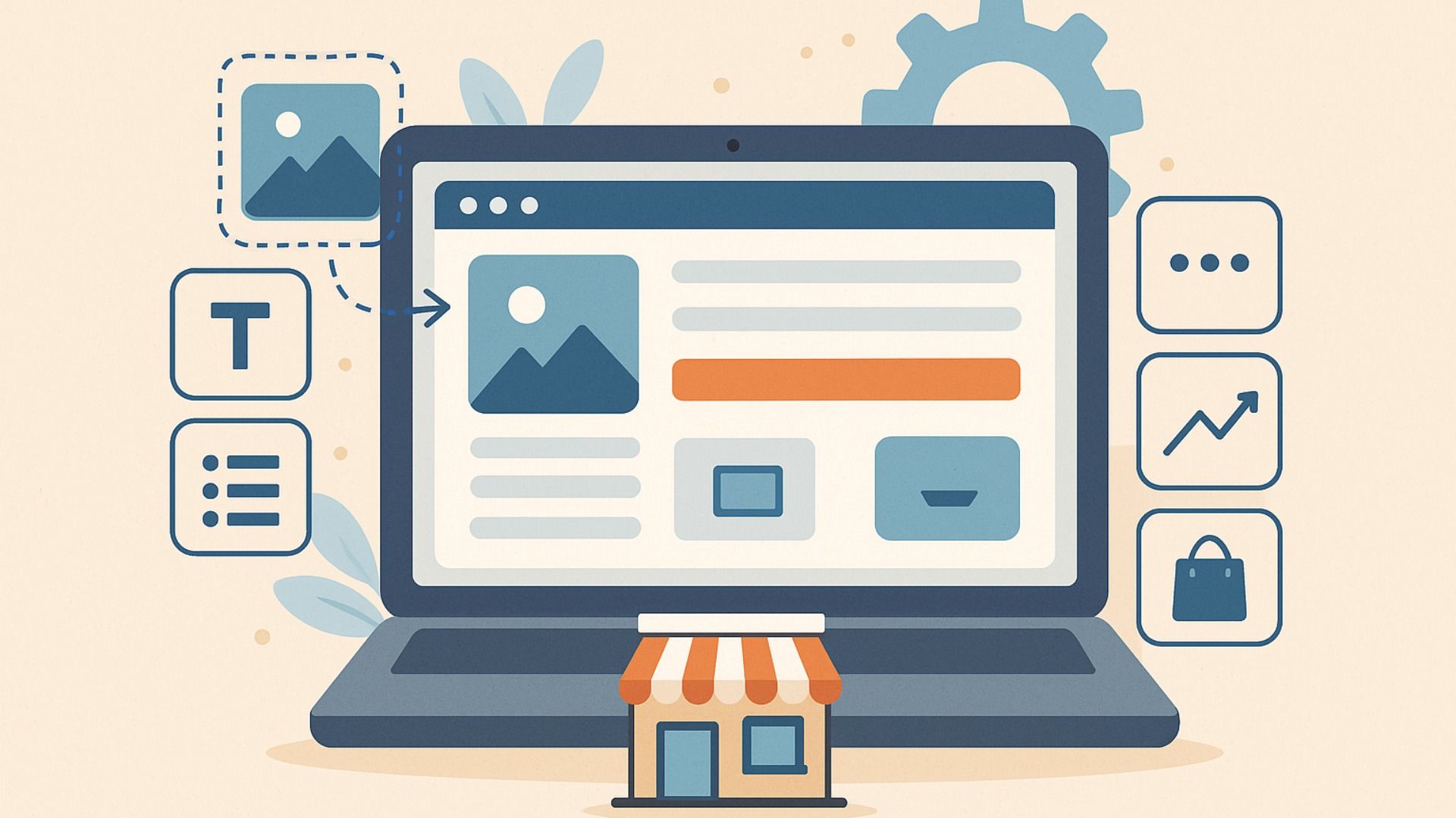
LaunchCMS is a cloud-based website builder designed for users with minimal technical expertise. It provides businesses and nonprofits with a hassle-free way to create a visually compelling online presence. Here’s how LaunchCMS ensures a smooth, responsive experience:
1. Mobile-Friendly Templates
LaunchCMS offers a variety of pre-designed, fully responsive templates that adjust automatically to different screen sizes. Whether a visitor is browsing on a laptop, tablet, or smartphone, the website layout remains clean and easy to navigate.
2. Auto-Adjusting Content for Consistency
LaunchCMS templates optimize text, images, and buttons for different devices. This means that text remains readable without zooming, images scale properly without breaking layouts, and buttons are large enough for effortless tapping on touchscreens.
3. Improved User Experience and Engagement
A website that loads quickly and functions smoothly across devices keeps visitors engaged. LaunchCMS optimizes page load speed and ensures that users can interact with the site without frustration, leading to lower bounce rates and higher conversions.
4. SEO-Friendly Architecture for Better Visibility
Search engines like Google prioritize mobile-friendly websites in search rankings. LaunchCMS’s SEO-friendly structure ensures that websites not only look great but also perform well in search results, helping businesses increase visibility and attract more visitors.
5. No Coding Required – Easy Management
One of the biggest advantages of LaunchCMS is its user-friendly interface. Users don’t need coding knowledge to create and manage a responsive website. The drag-and-drop functionality allows for effortless customization while ensuring mobile compatibility.
Why Businesses and Nonprofits Need Responsive Websites
For small businesses and nonprofit organizations, having a responsive website is crucial for:
- Reaching a wider audience: More than 50% of web traffic comes from mobile devices. A responsive design ensures potential customers can access your site anywhere, anytime.
- Building credibility and trust: A well-structured, mobile-friendly website gives a professional impression, boosting customer trust.
- Enhancing conversions: A seamless user experience leads to better engagement, whether it’s making a donation, signing up for a newsletter, or purchasing a product.
Conclusion
In an era where multi-device compatibility is essential, LaunchCMS makes it easy for businesses and nonprofits to maintain a consistent, professional online presence. By leveraging responsive web design, users can ensure their website is accessible, engaging, and optimized for any screen.
LaunchCMS.com - Blog


